Header Options
There are multiple options for how to display a header on your page.
- Normal
- Hidden
- Graphic
- Marketing Landing Page
- Hero
These options can be found in the page editor below the Gutenberg block editor.

Normal
This is the default header option. In most cases, this is the option that you should use for your page if it is a basic text page. It displays the title of your WordPress page over a red line.

Hidden
There are not many instances where you should hide your page title.
One example would be if you added a UAMS Hero block as the first block on your page, rather than using the Hero header option (detailed below).
Before applying this option, reach out to the web team if you think this option is right for your page.
Graphic
We recommend this option for any page that is comprised of blocks other than the normal text blocks (paragraphs, headings, etc.). An example of this would be if you were building a landing page with the UAMS blocks (CTA Bar, Call-Out, etc.).
We also recommend this option for basic text pages that are top-level pages, meaning they are not the child of another page. These are often the pages on your primary navigation that are not nested under another menu item. A page can also be considered a top-level page if it is the immediate child of a page that has been designated as a subsection.
Before applying this option to any other pages besides those addressed here, reach out to the web team if you think this option is right for your page.
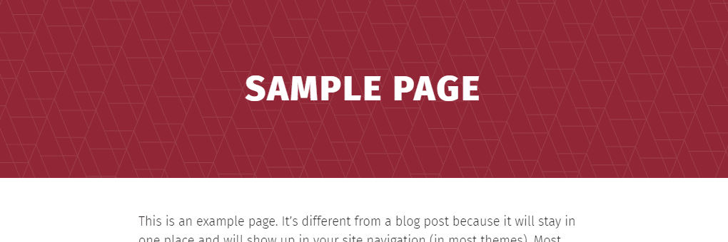
The Graphic option creates a full-width red box with a white page title in all-caps. A faint pattern of triangles is overlaid on top of the red background.

Background Image
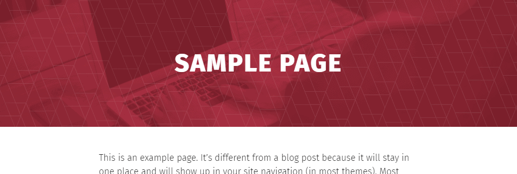
You have the option of selecting an image to display in the background. This image will be automatically converted to be a monochromatic red version of itself and placed below the layer of triangles.
The image must be a photo. This can be a UAMS photo or a stock image relevant to the purpose and context of the particular page. Logos must not be used.
We recommend you crop your image to an 8:3 aspect ratio before uploading it to your site. If you do not crop it, the system will automatically crop it down to that aspect ratio, which may result in undesirable composition.
We also recommend choosing an image that doesn’t have a very specific focus point, as it may not be visible in the header container. You may need to experiment with different images to see what works best in your specific Graphic header instance.
The recommended image size is 5120×1920, so that high-density pixel displays can show the best version of the image. However, the minimum dimensions for the image are only 1920×720.


Marketing Landing Page

This option is reserved for landing pages landing pages built for specific marketing campaigns that include things like paid search, magazine advertisements, Facebook ads, billboards, etc. Do not apply this to your page unless you are creating a marketing landing page. Before applying this option, reach out to the web team if you think this option is right for your page.
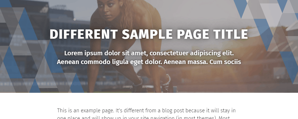
This header option creates a full-width container that places a background image behind the UAMS triangle pattern in blue, white and gray.

Text Elements
You must set a new text value for the title. This is so that there can be a character limit on this title. It also allows you to display a different title than the one that would show up on the browser window or on Google. You can reuse your page title if you want, as long as it is at or under the character limit.
You may also add a brief lead paragraph that either helps describe what this landing page is about or provides a kind of subtitle.
Text details:
- Marketing Landing Page Title Heading
- Character limit: 62 characters
- The heading text should be more than one word.
- The heading text should be capitalized using the AP Style rules for composition titles.
- Marketing Landing Page Title Lead Paragraph
- Character limit: 117 characters
- The lead paragraph text should be written in full sentences and should use proper punctuation.
Image(s)
The image must be a photo, preferably one containing people. This can be a UAMS photo or a stock image relevant to the purpose and context of the particular page. Logos must not be used.
You can upload a single image to the Desktop image input and let the system automatically crop the image for the mobile breakpoint. Or you can upload one version for Desktop and another for Mobile.
We recommend you crop your image to the appropriate aspect ratio(s) before uploading it to your site. If you do not crop the image, the system will automatically crop it down to those aspect ratios, which may result in an undesirable composition.
The appearance of the image will be automatically adjusted to provide sufficient contrast between the image and the text so that we can meet accessibility guidelines.
The UAMS triangle pattern will automatically be placed over the image.
Image details:
- Image, Desktop
- The desktop image is required.
- The desktop image will be displayed when the browser viewport size is at a width associated with desktop and laptop computers.
- Minimum image dimensions: 1435×768
- Recommended image dimensions: 5120×1600
- The desktop image will automatically be cropped to a 16:5 aspect ratio.
- Image, Mobile
- The mobile image is optional. If an image is not defined, the desktop image will be cropped and resized to the necessary dimensions.
- The mobile image should be defined if automatically cropping and resizing the desktop image would yield undesirable results.
- The mobile image will be displayed when the browser viewport size is at a width associated with tablets and other mobile devices.
- Minimum image dimensions: 992×806
- Recommended image dimensions: 1984×1612
- The mobile image will automatically be cropped to a 16:13 aspect ratio.
Hero

While the UAMS Hero Block can be added to the page like any other block, we have included the option here to save you the step of having to also set the Hidden header option.
The hero should only be used as a navigational aid. However, it should not simply duplicate the site’s primary navigation. Featuring one item that also exists on your primary navigation would be acceptable, but it should generally feature an item that is not otherwise included on the site’s primary navigation or on an adjacent UAMS Action Bar block.
Text Elements
All of the text elements in the hero are required.
Text element details:
- Heading
- Character limit: 49 characters
- The heading text should be more than one word.
- The heading text should be capitalized using the AP Style rules for composition titles.
- Body
- Character limit: 177 characters
- The body text should be written in full sentences and should use proper punctuation.
- Button Text
- Character limit: 29 characters
- The button text should be more than one word.
- The button text should be an action phrase but must not be
Click Here. - The button text should be capitalized using the AP Style rules for composition titles.
- Button Link Description
- Character limit: none
- The button link description should begin with the same text that is used for the Button Text to meet WCAG Success Criterion 2.5.3 Label in Name.
Image(s)
The hero image is automatically composited with a color panel that is behind the text.
The hero image must be a photo, preferably one containing people. This can be a UAMS photo or a stock image relevant to the purpose and context of the particular slide. Logos must not be used.
We recommend you crop your image(s) to the appropriate aspect ratios before uploading it to your site. If you do not crop it, the system will automatically crop it down to those aspect ratios, which may result in an undesirable composition.
Image details:
- Image, Desktop
- The desktop image is required.
- The desktop image will be displayed when the browser viewport size is at a width associated with desktop or laptop computers.
- Minimum image dimensions: 1435×768
- Recommended image dimensions: 2870×1536
- The desktop image will automatically be cropped to a 1.8685:1 aspect ratio.
- Image, Tablet
- The tablet image is optional. If an image is not defined, the desktop image will automatically be cropped and resized to the necessary dimensions.
- The tablet image should be defined if automatically cropping and resizing the desktop image would yield undesirable results.
- The tablet image will be displayed when the browser viewport size is at a width associated with tablets.
- Minimum image dimensions: 1156×818
- Recommended image dimensions: 578×409
- The tablet image will automatically be cropped to a 1.8685:1 aspect ratio.
- Image, Mobile
- The mobile image is optional. If an image is not defined, the desktop image will be cropped and resized to the necessary dimensions.
- The mobile image should be defined if automatically cropping and resizing the desktop image would yield undesirable results.
- The mobile image will be displayed when the browser viewport size is at a width associated with non-tablet mobile devices.
- Minimum image dimensions: 1536×864
- Recommended image dimensions: 768×432
- The mobile image will automatically be cropped to a 16:9 aspect ratio.
Number of Slides
The hero can contain one to four slides, though the use of more than one slide in a hero is discouraged. User engagement with slides beyond the first has been proven to fall off significantly.
Background Color
If the background color is set to Auto, the slides will automatically be set to a predefined sequence of colors. The use of background color options other than Auto is discouraged. If background color options other than Auto are used, the first slide should be set as red while the subsequent slides must not repeat the color of another slide in that hero.
Background color choices:
- Auto (Sequence: Red, Blue, Green, Eggplant)
- Blue
- Green
- Teal Blue
- Eggplant
- Maroon
- Orange
